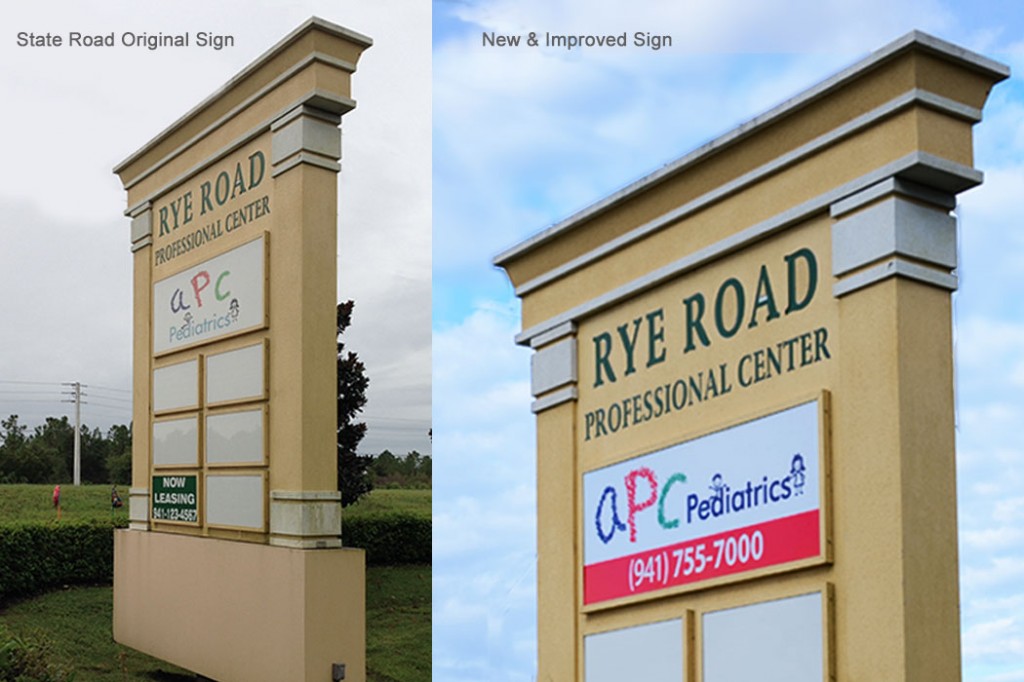
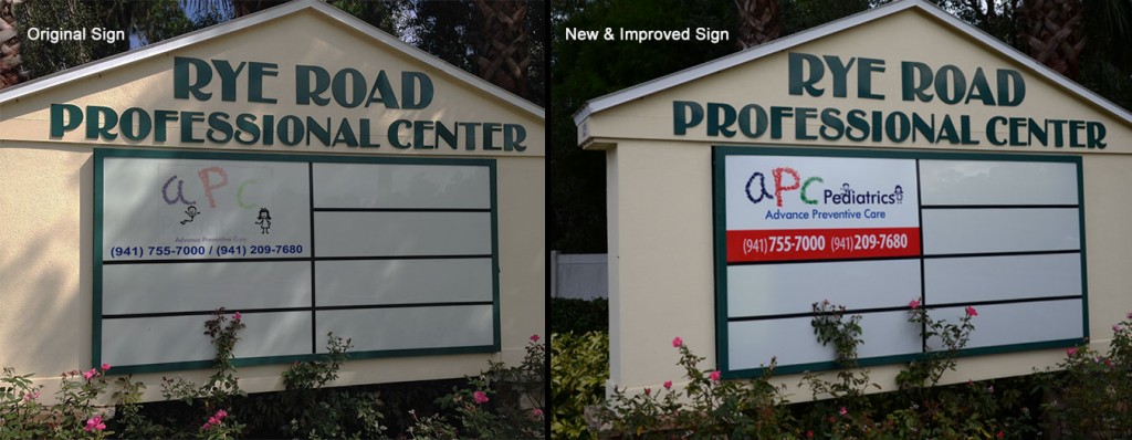
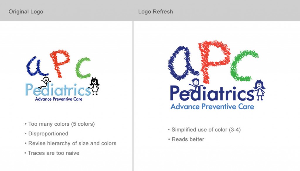

The Challenge
The oldest location of this pediatric practice needed new signs. The original logo was 10 years old and the client did not have a vectorized file to blow up for wide printing/ sign making.
The Plan
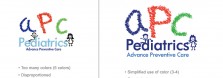
Before vectorizing the logo, I explored ways to improve the readability and application of the logo. It needed to look less naive, more compact and organized. Also, the words "Pediatric" and "Advanced Pediatric Care" needed to be more prominent as they are an essential part of the name and business concept.
The Solution
The letters APC were redrawn in vectors. They kept a crayon-like texture. However, the letters were stylized and now create a more harmonious effect. The quality of this new file allowed us to replace the exterior signs of this location.